Scraping By: Housing Prices in Raleigh

God Bless This Lousy Apartment

This was inscribed on a decorative plate that I found in a thrift shop in the back roads of northern Virginia. It was $5 dollars, so, naturally, I bought it. As soon as I got home to Raleigh I decided to prominently display this treasure for all to see – including my wife… Ever since, I have not lived a day without hearing how we need to move into a house. Decisions always seem worst in retrospect, don’t they?

But this did get me thinking – could I build a simple prediction model that would get me within the price for a given house in the Raleigh area based on easily accessible information (acreage, style, etc.). The answer, kind of… Who knew that housing prices were so complex?

Sampling

Getting the data was the meat of my journey. Thankfully, Wake County saves the taxed value of properties with some information about their construction and size on their early 2000’s website – http://services.wakegov.com/realestate/. My saving grace was the multitude of search options a person could use to search property and tax information.

Search Box

Namely, I could search by a Real Estate ID. There are roughly 400,000 households in the Raleigh area. I did not want to pull all of the data, since my cheap Lenovo Yoga laptop from Walmart could not handle this load. Instead, I decided to pull a random sample of 1% (4,000) of records from this site.

Random NumberHere is the portion of my code used to do so. I created an empty set to house the ids, so building information would only be pulled once for a given ID. Then, I used a random number generator to pull one number, assign that to the ID, format it (so it would work in a url – we will see this later), and then pull the information on this ID if my computer had not already done so.

Scraping

Building a scraper will make you feel 200% cooler than you actually are – I highly recommend it. It’s even easier in the advent of tools that R-developers post online. I used the SelectorGadget by Hadley Wickham to get the source code for the information I wanted to pull from the government website.

The Scraper

The information I needed was on two different pages on this site. By subbing every randomly drawn ID into the base URLs, I could pull this information. Then, thanks to the SelectorGadget, I could pull what I wanted to be pulled (look at accountscrape =).  The rest of the code pulls and formats the html information into usable data for me. Now, the loop continues for about 200 more lines: working through errors I encountered (who knew this website would have so many errors?) and building the data-frame for my sample. Ultimately, for every building in my sample, I pulled: Real Estate ID, Building Type, Units, Heated Area, Story Height, Style, Basement, Exterior, Heating, Air Conditioning, Plumbing, Year Built, Add Ons, Remodel Year, Fireplaces, Fire District, Land class, Zoning, Acreage, and Total Value. After much cleaning, I could finally build some models.

Model Building

I ended up building three different models by minimizing AIC, looking at the value of information, and using intuition. To test the utility of these models, I pulled 90 more housing IDs from the Wake County site as a testing set and predicted their housing prices using the models to compare against their government assessed value.

Model 1: `Total Value Assessed` ~ `Heated Area` + `Story Height` + Style + Basement + Exterior + Heating + `Air Cond` + Plumbing + `Year Blt` + Fireplace + Acreage

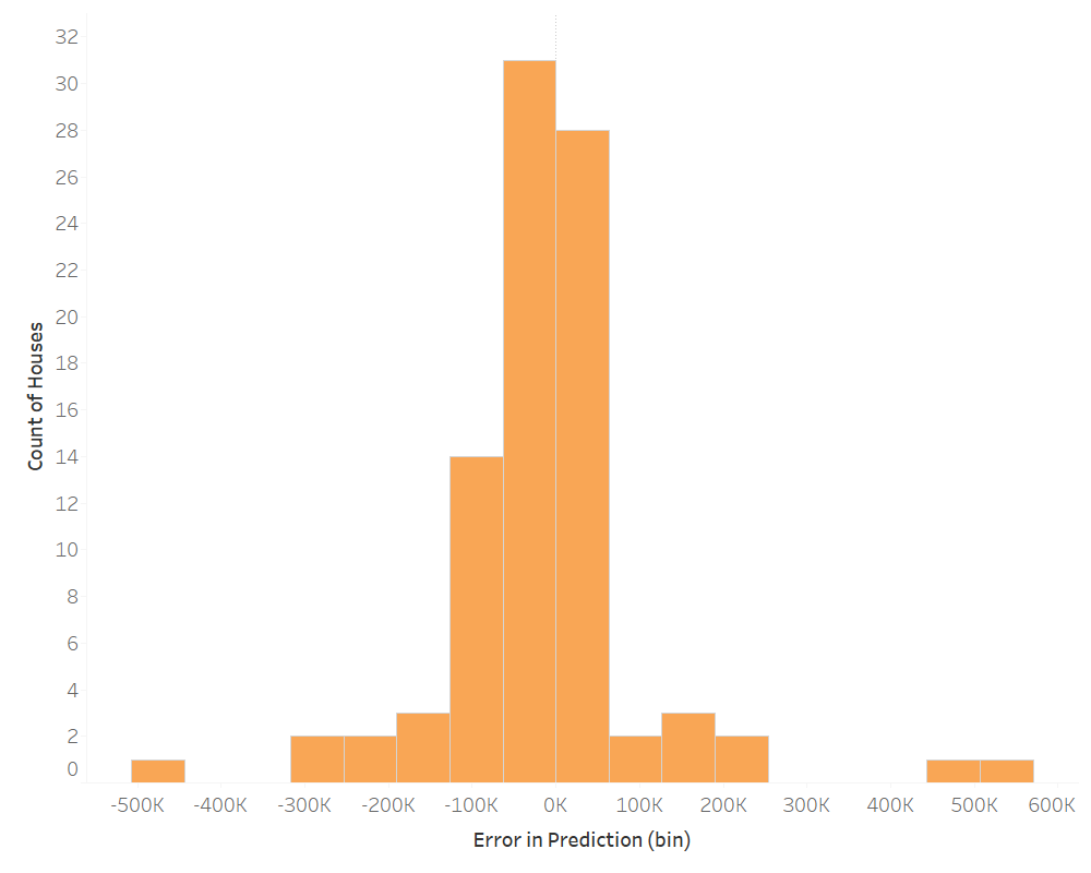
The adjusted R^2 for my first model was 0.72. This means that 72% of the variance in the value assessed to a home was explained by the variables included in this model. This isn’t too shabby, considering the complexity of homes and pricing – especially since specific location data was excluded. Below is a histogram of the distribution of the counts of houses that fall into different error (predicted housing value – assessed housing value) bins.

Pred 1

On average, this model under predicted by $18.7K. But, that is the funny thing about statistics – direction can effect the magnitude as it relates to averages. When we look at the average absolute difference between a prediction and the value assessed we see a difference of $73.6K. This is the difference between a 8.6% average error in prediction and a 22.7% average error. However, looking at the actual distribution gives us a better idea of what is going on. The model tends to do better at predicting than it does not (~50% of the time), but the length of the the tails could lead you to severely over pay for a house. So, at an individual housing price level this model may not be the best… But, in the unlikely case that you are looking at 100 to 1,000 homes,  and you want to purchase them all at one time from one person, this model might serve you well…

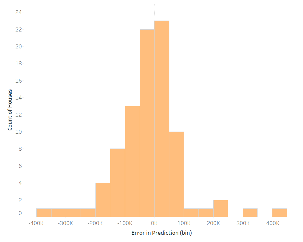
Model 2: `Total Value Assessed` ~ (`Heated Area` + `Story Height` + Style + Basement + Exterior + Heating + `Air Cond` + Plumbing + `Year Blt` + Fireplace + Acreage)^2

Introducing two-way interactions among all the variables in our previous model increases the accountability for variance to 0.85 (adjusted R^2). So, how did it perform?

Pred 2

This model is infinity more complex due to the number of variables and the relationship between factors and factors or factors and continuous variables. We see an increase in the count of houses in the middle of the distribution, which means it is more accurate on average than the first model. But, the tails also become more extreme in their difference. On average, this model under predicted by $13.8K; this is an improvement on our original model. But, the average absolute difference between prediction and the value assessed is actually $74.7K.

Model 3: `Total Value Assessed` ~ `Heated Area` + Acreage +  `Year Blt`

Our other models have been relatively convoluted. I decided to pick out three variables that I thought would influence price to see how it predicted. Here are the results.

Pred 3

In this case, the adjusted R^2 was 0.69 – not far off from our first model. On average, this model under predicted by $19.7K. The absolute average was $77.4K. The distribution was similar to our first model. Not too bad for a model with only three variables.

Conclusion

So, when we inevitably go house shopping will I use any of these models? Probably not, but some interesting information can still be derived.

  • Are you a gambler? Then a two-way interaction model might be for right you. You increase your odds of accuracy, but you also increase the magnitude of error if the model is inaccurate.
  • Are you risk adverse? Then go simple, and spread your potential for loss across different scenarios. But, who doesn’t like a little excitement?
  • Are you looking for a house? Then trust your realtor.

I believe that location, location, location, is a large determinant for the price of a house. Integrating this data would greatly increase the predictive properties of my models. Housing prices are also largely dictated by the market – supply and demand, interest rates, and economic growth. This, in addition to the data in my models, would greatly improve their predictability. But, for now, trust your realtor. They are the experts.


Enjoy this post? Take a look at past posts:

World Happiness

Tips on Restaurant Success

Airbnb in the Big Apple

Michael Jordan vs Lebron James

NYC: Where to go for a night out?

Risky Business and Rare Cooked Steaks

Fact or Fiction: NFL Home-field Advantage

The Human Footprint on Our World

It’s the holiday season and what better way to celebrate a time of cheer and reflection than by evaluating the human footprint on the world. Following this years assault on the environment, especially in the United States, I wanted to uncover the nature of our footprint – how wide and how deep is our mark. It is no coincidence that I stumbled upon a data-set curated by the Global Footprint Network, which is where our journey begins.

The Data

Per the network,

Biocapacity is measured by calculating the amount of biologically productive land and sea area available to provide the resources a population consumes and to absorb its wastes, given current technology and management practices. To make biocapacity comparable across space and time, areas are adjusted proportionally to their biological productivity. These adjusted areas are expressed in “global hectares”. Countries differ in the productivity of their ecosystems, and this is reflected in the accounts.

The Ecological Footprint of Consumption, in this case, indicates the “consumption of biocapacity by a country’s inhabitants” as a product of their Ecological Footprint of Production and their Net Ecological Footprint of Trade (imports – exports). This data set includes records from 1961 to 2014.

My entire analysis moving forward was conducted at a per capita level of a country’s inhabitants to mitigate population differences. Now that we’ve introduced a ton of confusing jargon, let me make things simple:

Ecological Creditors = Good

Ecological Debitors = Bad, probably

For you, just remember that a country contributes, as a creditor, if its footprint is smaller than its biocapicity; a country takes, as a debtor, if its footprint is larger than its biocapacity. Let’s dig in.

Global Overview

1961 - Total2014 - Total

The maps above show a comparison in ecological impact from 1961 to 2014 (the range of the data set). A simple eye test leads you to learn that no country has gotten better over this time period – in fact, even the strongest creditors to the environment have started to consume more and more. As of 2014, here are the countries with the greatest biological productivity.

Top 5 Creditors to Society (2014):

  1. French Guina
  2. Suriname
  3. Guyana
  4. Gabon
  5. Bolivia

Here are the countries with the worst biological productivity.

Top 5 Debtors to Society (2014)

  1. Quatar
  2. Luxembourg
  3. United Arab Emirates
  4. Bahrain
  5. Kuwai

Countries in Africa, especially ones that are still agrarian in nature, tend to have the best equilibrium between production off of the land and their overall consumption – contributing more to society than they receive. Countries of the Middle East that rely heavily on imports, tend to be less productive. So, why is Luxembourg number two? I surmise this is due to their small population, which makes it difficult to reach economies of scale, and their geographical location, landlocked in the middle of Europe.

It can be seen globally, over time, what we take from the land is not being checked by what it contributes. To better understand this notion, I wanted to look at the key indicators that make up the Ecological Footprint.

Global Breakdown by Indicator

The Ecological Footprint is a combination of consumption, production, and trade based on the capabilities of four unique land types that contribute to our ability to live: forest land, crop land, fishing land, and grazing land. In addition, this formula accounts for pollution, we will see more on this later. A more comprehensive guide to these variables can be found at the link posted in the intro – but, these definitions are pretty self-explanatory.

To encapsulate most of the countries available, I analyzed these four land types by country at 1994 and at 2014. Again, these maps indicate the differences in the Ecological Footprint of Consumption over time. The brighter the hue of green or blue, the greater surplus of that land type. The browner, the greater the negative impact.

This slideshow requires JavaScript.

Similar to the global overview maps at the beginning of this post, we see a widening in the Ecological Footprint of Consumption across these four land types. To get a better understanding, I took the world average of the differences between consumption and production and plotted them over time by each land type. See below.Global Over Time

If the y-axis is difficult to understand, that is okay. Focus on the trajectory of the lines and the magnitude of their changes over time. The demand for crops routinely outweighs the supply of crop lands. Available forest land has dropped the most dramatically over the time span, but has made resurgences in 2000 and 2014. Land available for grazing has been slowly diminishing over time. If not counteracted, it will replicate crop land – there will be a global demand that outmatches supply. Fishing has been cyclical, but has been sloping down since the 1980’s.

None of these insights are especially positive. There are only two options for combating these trends: produce more land or monitor consumption in lieu of excess. Which seems feasible to you?

After uncovering these insights, I was interested in how the United States fairs…

The United State of Capitalism

While the United States was not a top 5 debtor of the earth’s resources, it isn’t far behind. The US had the 16th largest imbalance between consumption and biocapacity. This is striking, considering the productive output of the country and the vastness of its ecology and resources. Let’s take a look at its per capita use of resources across the different land types over time.

US Over Time - Carbon

On pace with the rest of the world, the United States has continued to demand more and more forest land and materials over time. Fishing has also seen a negative trend. Contrary to the world’s average, the US sees a positive difference in consumption and available crop land. This would be a positive, if there wasn’t an evident downward trend. The only land type seeing a comeback is grazing land (from negative to almost zero).

Now you may be thinking, “Camden, what’s the big deal? The United States had a negative Ecological Footprint of Consumption before, but this graph looks positive! We are actually helping the world – we should be a creditor NOT a debtor…”

This graph doesn’t look too bad, huh? Well, as I mentioned before, the last part of the  formula is pollution (i.e. carbon emissions). This is defined as the global hectares of world-average forest required to sequester carbon emissions from a particular region. I’ve introduced the same graph with this variable included below…

US Over Time + Carbon

The surplus of the resources we create is greatly outweighed by the pollution we produce. As of 2014, we produced 4x more of a negative impact on the globe from pollution than the resources we “credited”. I’m no accountant, but that doesn’t look like a balanced sheet.

After unraveling this tale, I thought there may be more to the story. Perhaps what we see is on pace with population growth. Or, maybe, GDP could lend us some answers. The graphs that follow look at these variables in comparison to the changes in the total per capita differences in demand and availability in the United States.

Footprint of Population and GDP

Pop vs Bio
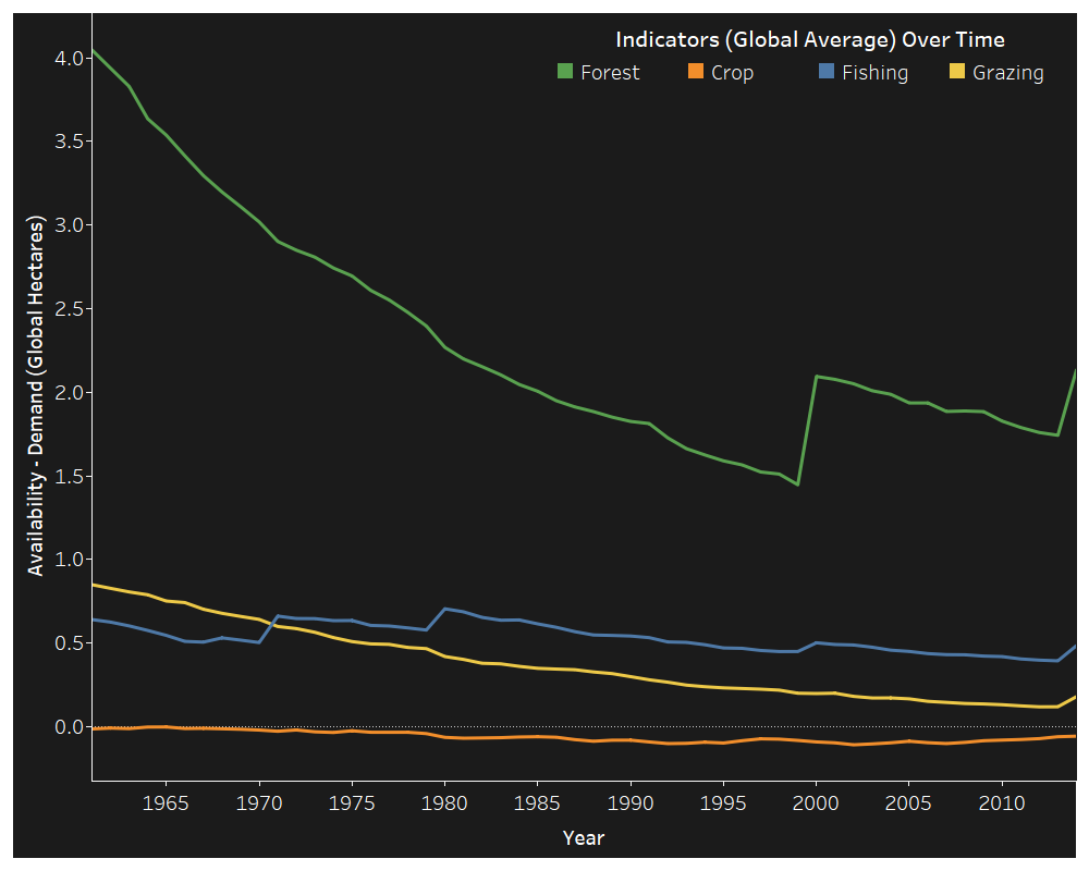
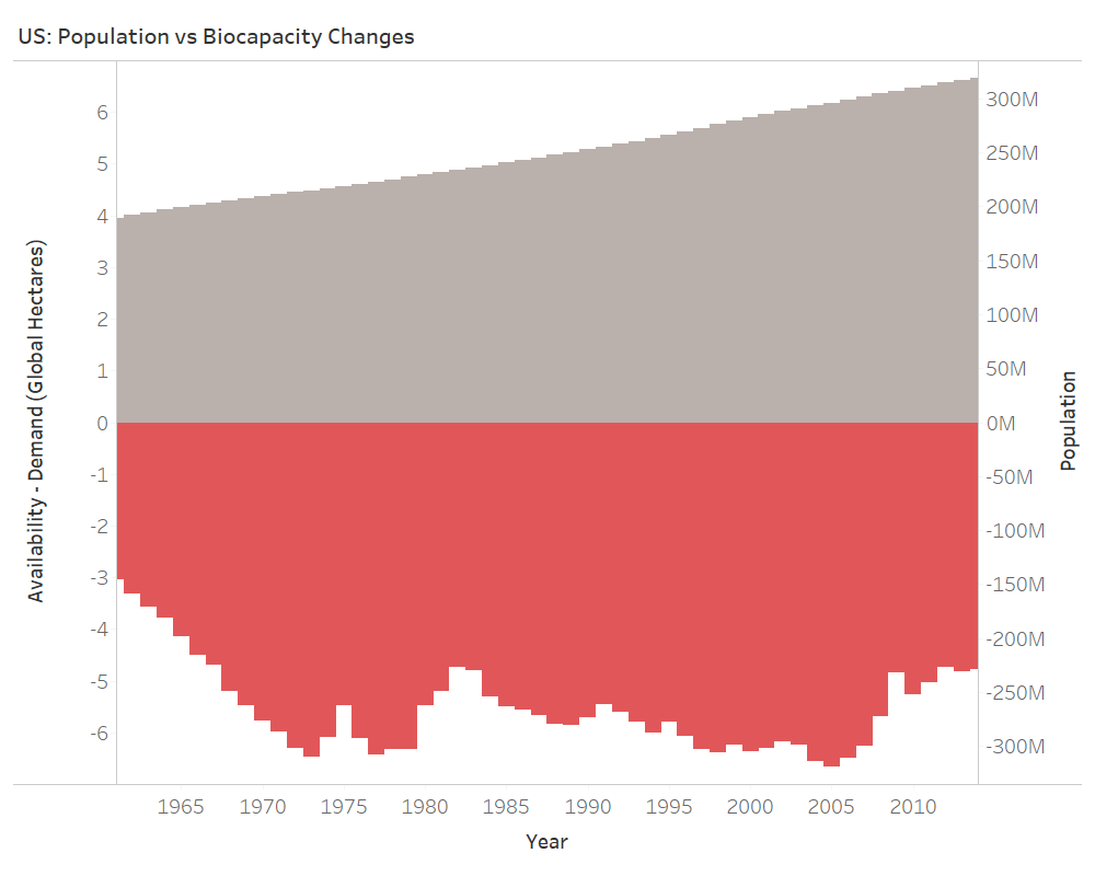
The US population has been growing at a linear pace since 1961. Changes in consumption have been more sporadic. Intuitively, population plays a role in in how much a country consumes. The variability in the plot of consumption, however, indicates more of an interaction between population and growth of consumption and any other number of variables not included in the data-set: policy, economic prosperity, war, etc. This being said, let’s take a look at GDP.

GDP vs Bio

Like population, GDP has also been growing over time. More interesting, however, is that a dip in GDP coincides with, or is around, a dip in consumption. Gross Domestic Product is the summation of the total production that took place in the economy. A higher GDP indicates more production, higher salaries, and overall, theoretically, more consumption by consumers. I will go out on a limb and state that the upward trend in population and GDP does in-fact relate to the the downward trend in the availability of all four land types through the nature of income, demand, and consumption. These changes are hard to see, because of the overwhelming effect of pollution.

GDP Grows on Trees

This information is not new, but rather should serve as an extension of a discussion that needs to continually take place. You can’t recreate land that is lost, but we as a global community can reduce our footprint by:

  • Changing consumption patterns, little by little, on an individual level.
  • Looking for efficiencies that cut the demand for resources and mitigate pollution.
  • Investing in human resources. Much of the earth is still rich with natural resources and the biggest dictator of their future is man.

Again, its the season of cheer. Create cheer for your family by working to shop smarter with your wallet this, and every, holiday season.

Cutting down a forest for timber adds to GDP, but what we don’t record is the loss to our wealth in terms of natural resources. Winnie Byanyima

Let’s work to correct the balance sheet.


Enjoy this post? Take a look at past posts:

World Happiness

Tips on Restaurant Success

Airbnb in the Big Apple

Michael Jordan vs Lebron James

NYC: Where to go for a night out?

Risky Business and Rare Cooked Steaks

Fact or Fiction: NFL Home-field Advantage

Text Analysis: Getting into Google

Text Analysis: Getting into Google

Two weeks ago I returned from the concrete jungle of San Francisco, lungs full of West Coast air and patience depleted from the West Coast traffic. Many of my peers asked how I did it? Who did I know? How did I draw up my resume to get through the process to an onsite interview? The answer was, “I don’t know.” It was mostly luck.

I had the opportunity to interview onsite at Google. I killed the interview. Not to brag, but I got my rejection email, and phone call – as if an email wasn’t enough, this past week. In any case, many told me that it was a success to even be considered by the internet giant. Even after I was denied, many asked me if there was a method to how I got in the door. I didn’t have an answer, but it did get me thinking… “What if I pulled Google job postings and ran some analysis to increase a person’s odds of getting an interview?”…

Methodology

Fortunately, thanks to the internet, I was able to find a data-set where someone had already done the scrappy work Google job postings have a standard layout, making it easy to scrape for the necessary information. Niyamat, who I found on Kaggle, used Selenium to scrape the Google Careers page for the job location, category, responsibilities, minimum qualifications, and preferred qualifications for every available job posting available a little under a year ago. I used his data set for the basis of my analysis.

Job Locations

job-map.png

One clear way to increase your probability of reaching success is to consider regions that have a higher proportion of job opportunities. Not surprisingly, when this data was taken, there were 640 job postings for offices in the United States. But, what were the top countries outside of the United States?

Top 5 Countries (Omitting the United States):

  1. Ireland (87)
  2. United Kingdom (62)
  3. Germany (54)
  4. Singapore (41)
  5. China (38)

One technique could be to target regions that are less popular as technology hubs but make up a significant proportion (omitting the US) of Google job opportunities. When you think of Google, you think of Silicon Valley, and so does everyone else. You don’t necessarily think of the areas surrounding the United Kingdom or Singapore. These might be locations to target. Beyond job location, I wanted to look at the teams within Google and their relationships with job postings.

Job Categories

job category bar.png

In addition to understanding where jobs are being posted, it is beneficial to know which teams garner the largest proportion of job postings. Sales and Account Management and Marketing and Communications are in a league of their own, making up ~27% of all job postings. But, what are the teams with the smallest number of job postings?

Toughest Teams to Get Into (based on count of job postings):

  1. Data Center & Network
  2. Technical Writing
  3. IT and Data Management
  4. Developer Relations
  5. Network Engineering

If you look at the midway point of the graph and move right, you’ll notice a larger proportion of the teams are more technical on the job spectrum. Though Google is a technology company, their focus in hiring is around client facing opportunities and business operations. In my own experience, myself and peers I have talked to, targeting jobs that are business facing increases your chance of getting an interview, and consequently a job, at Google, which will allow you to work up the ladder and earn a technical position later. This seems to be backed up by the data.

But, beyond targeting opportunities based on job location and team, how can you increase your chance of getting an interview? One common thing you’ll hear in any job search is to “match” your resume to the job posting. While this is true, text analysis may help us uncover what is more important to Google representatives as a whole (not just by position), allowing you to craft a resume to increase your odds of landing an interview across the organization.

Responsibilities


response dash

After running text analysis on the “Responsibilities” section of 1,250 job postings, here are the terms that came up the most. Two things to call out. First, these terms are the stems, used to group similar words (English is a complex language after all). Second, the first number in the tree map is the total number of times that the term was seen (total count). The following number is the number of jobs that this term was seen in (job count).

Collaboration, development, management, and dealing with product appeared in ~50% or more of the job postings. Other notable terms include: support, market, process, design, project, drive, solution, identify, etc. Having experience in these fields is very important. But, even more important for getting your resume seen, including these terms, no matter the job posting (within reason), will increase your odds of having your resume match a job posting and potentially lead to an interview.

In addition to looking at the most frequent terms, I also wanted to see their relationships to each other. Below is a graphical representation of the hubs, authorities, and clustering of the terms and job responsibility descriptions.

This analysis reflects my previous point, that many of the important responsibility terms are shared across job descriptions and have links to many of the other terms – flowing to and from each other regardless of the type of job or description. The second graph is meant to show clusters of terms based on job descriptions. What is interesting is that it cannot be easily discerned that there are different clusters of jobs based on responsibilities to base our analysis. What does this mean? It means that these terms are influential across all types of jobs and their related job postings. This echoes my previous sentiment – include terms with high frequencies across job postings when casting a wider net to increase your odds, since job postings tend to be similar, at a high-level, across the stated responsibilities.

Minimum Qualifications

In addition to responsibilities, that you as an applicant want to match, it is also important to understand what minimum qualifications are required.

min qual dash

While minimum qualifications will differ depending on the team, location, and level of the job, there are important things to look for across most job descriptions. Across ~80% of job postings, having the appropriate practical experience and degree are a minimum requirement. This shouldn’t be news to anyone reading this post. What is novel are the other terms, which you could use to set yourself apart on your resume.

At a minimum, Google HR is looking for people who are efficient communicators, both in writing and in physical conversation. Fluency in a foreign language will also help to set you apart. Understanding in programming, marketing, engineering, and possessing general experience with technology, can help you leap this minimum qualification bar across a significant proportion of job descriptions.

Again, I wanted to look at the relationships of these terms and their associated job descriptions. The first graph shows terms that appear in 5% or more of job postings.

minimum qual .05

Unlike responsibilities, we see two clear clusters emerge: jobs for interns, MBAs, and new graduates, and jobs for more experienced employees. For experienced employees, they are looking for specific skills and experiences: SQL, Java, foreign languages, development, media, strategy, etc. For new graduates, they are looking for basic requirements – are you a student? And, they are looking at your availability – can you start in May or June? While they want experience and skills coupled with these minimum requirements, education and start date are uniquely important to this cohort.

While this is interesting, I wanted to cut down on the number of important terms. Below is a network analysis of terms that appear in 10% of job postings.

Similar to responsibilities, there is only one cluster for minimum qualifications. Understanding these minimum qualifications and understanding how to craft them into your resume will help you to get past the proverbial resume bot.

Preferred Qualifications

The last section I analyzed was “Preferred Qualifications”. Below are the most frequent terms.

pref qual dash

You’ll notice that many of these terms are similar to the minimum qualifications. So, why have two different sections? Well, here they are looking for you to demonstrate your unique abilities and skills. They want you to have project experience. But, interestingly enough, across many of the positions, they want to see that you are knowledgeable, that you know how to handle relationships, that you work well in diverse teams and environments, that you are effective in the work that you do, that you know how to work with data, and, finally, that you know how to use Microsoft Excel. A lot of these are gimmes, but don’t miss out on getting an interview because you didn’t include them in your resume – they are in the “Preferred Qualification” section for a reason.

After analyzing these frequencies, I ran a network analysis. Originally I ran it at the same 5% level as I did for the minimum qualification analysis, but the result was too crowded and not useful for interpretation. So, I ran the analysis on terms that appeared in 10% or more of job postings and some groups actually started to emerge.

Preferred qualifications is where job descriptions start to take on their own character – this is the only place we see numerous clusters. These clusters seem team oriented: solutions, science (presumably data), and design. There also appears to be a preference for master’s students, judging by the green cluster. Even so, many of the terms are shared between clusters and make up a giant cluster of their own indicating what we’ve already uncovered. That is, that many of the job descriptions share similar components in the way they describe their preferred qualifications.

Final Thoughts

So what? Well, first off, your guidance counselor apparently knows what they are talking about. Google does care if you have a degree (they might even prefer a master’s degree). Google does care if you have their minimum qualifications and skills. But, even so, job postings may not be as different as you or I previously believed.

There might be ways to increase your odds of getting your resume through the job submission black hole and into the right hands, across job postings, which may lead to an interview. Here are some final thoughts from this analysis:

  • Target the United States. In addition, look for Google locations that have a high number of offerings but may not be seen as a technology hub.
  • Target business and operation facing teams. They have the lion-share of the job postings and may allow you cast a wider net for opportunities. Avoid technical leaning positions, especially if you are earlier in your job journey.
  • Look for ways to streamline your resume for Google’s needs. They clearly have items they look for, no matter the position or team. Here are some examples of what to include:
    • Responsibilities: Experience with collaboration, development, management, product, support, marketing, processes, design, projects, driving solutions, identifying challenges and solutions, etc.
    • Minimum Qualifications: Efficient communication (written and spoken), fluency in foreign languages, experience with programming, marketing, engineering, technology, etc.
    • Preferred Qualifications: At a high level, should definitely include – knowledge, relationship management, experience in teams and environments, effectiveness, experience with data, and excel expertise. Need to customize to better fit job description, depending on the team.
    • Know Excel: Apparently data-driven tech companies still feel that this needs to be stated…

Last Note: Google revolutionized how we engage with information. Though it is an amazing company to work for, there are many other companies paving the way in Big Data, martech, and digital solutions. I hope you find this analysis helpful and guiding, but it doesn’t replace hard-work, dedication, and passion. If you are on the job-hunt, enjoy the journey! You will be rejected. It happens. But as they say, when one door closes another one opens.

I don’t want to live in a world where someone else is making the world a better place better than we are. Gavin Belson

If you have any questions (about this blog post, the job search, or anything else), feel free to reach out! For those on the job hunt, I highly suggest this book for alleviating unnecessary anxiety and work:


Enjoy this post? Take a look at past posts:

World Happiness

Tips on Restaurant Success

Airbnb in the Big Apple

Michael Jordan vs Lebron James

NYC: Where to go for a night out?

Risky Business and Rare Cooked Steaks

Fact or Fiction: NFL Home-field Advantage

Fact or Fiction: NFL Home-field Advantage

Imagine you are in “Death Valley”. It’s a concrete jungle, with Clemson Tigers and orange plastered season ticket holders ready to defend their beloved rock. Now imagine you are a NC State fan, the only one in a sea of South Carolinian hopefuls – your only comrade is a Georgia Tech graduate, who has decided to become part of the “pack” for this one day against #3 Clemson since your tipsy wife offered up her ticket half-haphazardly at a wedding the weekend before…

Like many of my posts, my analysis stems from a question. This time, my Georgia Tech friend got me thinking. He turned to me in the middle of the 3rd quarter, as NC State was down 31 to 0, and exclaimed, “Man it’s loud in here! Do you think there is really such a thing as home-field advantage?”

If there is, I haven’t seen it at NC State… but this did get my brain churning…

Methodology

I decided to analyze data on the NFL, because it is more readily available, stadium sizes are more equivalent in size than college stadiums, and there is more accurate data on weekly attendance numbers. I consulted one of my favorite sites for such data, Pro Football Reference. I pulled weekly performance data, by season for every team, from 2007 to 2017. I was able to obtain the ending score, stadium attendance, and yard and turnover spread for the winning and losing teams – which I coerced into home vs away data.

While I understand that many may debate the value of defensive play as it is benefited by home-field advantage, weekly data was not easily accessible. Since I looked at aggregates of team performance when they played at home and away, as well as their overall performance, I believe that my methodology was a good ol’ duck tape fix over this concern and I felt comfortable moving forward.

The Gridiron

Home teams won 58% of the time from 2007 to 2017.

While not conclusive, discovering this point added some validity to my hunch. Here are how the rest of the variables, points, yards, and turnovers, played out…

Home Team Aggregate Data

This graph looks at the differences between home team performance and away team performance at a macro level – as averages across the NFL. On average, home teams tended to score 12% more points, produce 4% more yards, and commit 5% less turnovers than away teams. While this is a valuable discovery, I soon found that analyzing the NFL as a whole may not be the best approach. So, I started focusing on team performance.

Teamwork Makes the Dream Work

We often hear about the 12th man on a team – the audience and fans that roar throughout the stadium. Here I take a look at the differences between home and away past performance on a key metric – win-percentage.

Team Win Perc 
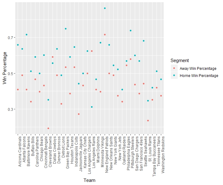
As it can be seen, the win percentage of games played at home tends to be higher than the win percentage of games played as a visiting team. Out of all of the teams over this 11 year period, there are only two teams where this does not hold: the Dallas Cowboys and Los Angeles Rams. The LA Rams have a much smaller sample size, due to their move in 2016, causing unsurprising variability from the norm. But, for Dallas, how can you claim to be America’s team when you aren’t even Texas’ team?…

The 3 teams that saw the largest percentage increase in win percentage when playing at home vs away were the Cleveland Browns (82%), Baltimore Ravens (75%), and the Minnesota Vikings (69%). While being bad over a long period of time will effect these numbers, causing home wins to be even more valuable, you have to chalk this up as a small victory if you are a Browns fan. Maybe there is a trophy out there for being “less bad” at home. Even if this is the case, I want to look at a home-field advantage’s effect on our other performance metrics. Below are treemaps of teams and their data. The size and color of the regions indicate the magnitude in the difference between their home and away performance relative to the other teams on that metric. It must be noted that these graphs only reflect teams that did better at home.

Team Points

88% of teams scored more points when the home team, compared to when they were a visiting team, on average. The teams that tended to score more at away games were the: Tampa Bay Buccaneers, Indianapolis Colts, Carolina Panthers, and Los Angeles Rams.

Team To

85% of teams gained more yards when the home team, compared to when they were a visiting team, on average. The teams that tended to have better production at away games were the: Tampa Bay Buccaneers, Indianapolis Colts, Cleveland Browns, and Philadelphia Eagles.

Team Yards

74% of teams committed less turnovers when the home team, compared to when they were a visiting team, on average. The teams that tended to have less turnovers at away games were the: Oakland Raiders, New York Jets, Dallas Cowboys, Tennessee Titans, San Francisco 49ers, Philadelphia Eagles, Kansas City Chiefs, Carolina Panthers, and Los Angeles Rams.

Now, you may be wondering, “Camden, across these 3 metrics, who tended to perform better at home games than away games? I want to have bragging rights as the best fan-base and the true 12th man, even though I know this analysis isn’t causal.” Well let me tell you, based on the mean percentage difference in performance across points scored, yards gained, and turnovers produced.

Top 5 (Home Performance vs Away Performance):

1. Los Angeles Chargers

2. Arizona Cardinals

3. Pittsburgh Steelers

4. Baltimore Ravens

5. Green Bay Packers

Bottom 5 (Home Performance vs Away Performance):

28. Washington Redskins

29. Philadelphia Eagles

30. Kansas City Chiefs

31. Carolina Panthers

32. Los Angeles Rams

The teams playing in Los Angeles only include their data since the move. The Chargers moved in 2017 and the Rams moved in 2016, meaning they have a limited sample size compared to the other teams. What is interesting is that if the Chargers were still in San Diego, they would be ranked 25th on our scale of home performance vs away performance. The Rams would be 5th if still in St. Louis. Have they flipped positions for the foreseeable future? Or is it a case of the Law of Small Numbers? I’ll let you be the judge of that.

Data Squib Kick

After all of this discovery, I desperately hoped there would be a correlation between differences in actual game-day attendance and performance. After hacking the data through function after function to get correlations by metric by attendance by team, I was left with my version of a data squib kick.

Team Corr

It wasn’t pretty and it wasn’t exciting. Interestingly enough, the newer Los Angeles teams are the ones with the highest correlation between attendance and the different metrics – I expect this to normalize over the coming years. While strong correlations do not exist, we can see that the data varies by team – indicating that attendance is more important for certain teams. In addition, attendance seems to be most highly correlated with wins across teams not located in Los Angeles. But, is this important?

Finally

This leads us to the final conundrum,

What came first? The chicken or the egg?

Or, in this case, the size of attendance or a good performance? While I cannot solve this, as of today, I have shown that there may be some truth to the nature of home-field advantage, so attendance numbers probably help to some un-quantifiable degree (we could clone the teams and have them compete with varying attendance numbers as part of an experiment – oh wait, this is happening in LA as we speak).

If you live in Cleveland, Baltimore, or Minnesota, opt for a home game – you are significantly more likely to see a win there. If you are a fan of the Dallas Cowboys or LA Rams save your money – your likelihood of seeing a win is higher for away games. If you are a fan of the Cardinals, the Steelers, the Ravens, or the Packers, you can *claim* that your fan-base makes your team better on game-day *though I cannot be held responsible for this flawed logic…*.  Lastly, the game of football is complex. There are a million opportunities in a game for luck, skill, and even the audience, to influence the outcome of a game. Though not definitive, I would state that there is some truth to the age old adage of home-field advantage. I mean c’mon, look at how Clemson throttled NC State…

Sure, the home-field is an advantage – but so is having a lot of talent. Dan Marino


Enjoy this post? Take a look at past posts:

World Happiness

Tips on Restaurant Success

Airbnb in the Big Apple

Michael Jordan vs Lebron James

NYC: Where to go for a night out?

Risky Business and Rare Cooked Steaks

Risky Business and Rare Cooked Steaks

I spent my whole life in the Charlotte area before going to college, so, naturally, all of my vacation time was spent going to Myrtle Beach. Beyond the put put (or mini-golf as it is known by the elite) and getting burnt on the beach, one tradition that sticks out in my mind is going to Miyabi Japanese Steak House.

An interaction that sticks out in my mind happened at this restaurant, between the acrobatic shrimp tossing and the onion volcano (spoiler alert). Taylor, one of my best friends from high school, and his parents had brought us to the steakhouse, as they always did. Ryan, again, a best friend, had never been to such an establishment. When the grand master hibachi chef asked Ryan how he wanted his steak cooked, he replied, “Well done…”. It was silent…

Then Taylor and his parents erupted in laughter, followed by the rest of the table. Ryan scrambled, gasping, “No! Not well done!…Medium well!” In our minds it wasn’t much better, his fate and our perception of him was sealed…

Why is their a stigma attached with the steak we order? Is it similar to what I receive when I order a Shirley Temple? A few years later, I am still curious. So, let’s dig in.

The Data

The data used for my analysis comes from a survey conducted by FiveThirtyEight. A topic that I had stumbled upon in my research of steaks and the human condition centered a lot around the tolerance of risk of a person and the temperature at which they order their steak. In a similar fashion, 538 used this survey to collect steak preferences, demographic data, and risk tolerance. For example, one question is, “Do you ever gamble?”

The percentage makeup of the respondents and how they order their steaks can be seen below (I sit firmly in the medium rare category with my fellow majority).

steakcount

Risky Eater Ranch

After obtaining the data, I decided to see how geographical location may effect our carnivorous habits. I’m from North Carolina, where we have sophisticated tartar eaters living in harmony with mean, well-done, steak eating machines. I personally like mine medium rare – a commendable char with a spice of danger. But, enough about me, how do the different regions like their steaks cooked?

steakregion

After coercing the 5 levels of steak temperature to numbers – Rare = 1, Medium Rare = 2, Medium = 3, Medum Well = 4, Well = 5 – we get a colored scale of where the regions sit. The size of the groups indicates the relative size that group makes up in our sample.

How do you compare to your region? New England and West North Central tend to like their steaks on the rarer side, with the Mountain region liking theirs as jerky.

Well, this is fine and good. But I haven’t yet defined if the cook of the steak that a person orders reflects their tolerance of risk. Let’s find out.

Factors Influencing Steak Temperature

factors

To figure out which factors may influence our steak preference, I looked at the average steak cooking preference (again, as a number) for each category. For the top box to the left, the left column is the riskier alternative. Yes indicates you have taken part in these activities – a side note, cheating means cheating on a significant other – and Lottery A is the riskier option (you will see the question later).

factors

The colors indicate what that group prefers: lighter red meaning a rarer cook and darker red indicating a more well done cook. At a glance, it appears that riskier activities translate to a rarer steak, on average, unless you skydive or cheat on a significant other. The oldest respondents also preferred a rarer steak and income modulated between choices.

Due to the variation between all of the categories, I decided to create a model to predict your steak preference based on your basic demographic information and risk tolerance (omitting regional domain).

Your Perfect Steak

My graph from before provided some insight, so I decided to set up a model that looks at the interactions between these variables to determine where you should be on the rare – well spectrum.

Think about these questions before checking out the tree below.

Consider the hypothetical situations (from 538’s survey):

  1. Do you eat steak? (If no, this will not apply to you.)
  2. In Lottery A, you have a 50% chance of success, with a payout of $100. In Lottery B, you have a 90% chance of success, with a payout of $20. Assuming you have $10 to bet, would you play Lottery A or Lottery B?
  3. Do you ever smoke cigarettes?
  4. Do you ever drink alcohol?
  5. Do you ever gamble?
  6. Have you ever been skydiving?
  7. Do you ever drive above the speed limit?
  8. Have you ever cheated on your significant other?
  9. What is your sex?
  10. What is your age?
  11. What is your household income?
  12. What is your education?

Classification Tree

The classification tree did not account for rare meat eaters… but who would? How did my classification tree do?

If your answers do not align with how you like your steak cooked, know that the survey had limited respondents and I may have over-fit the data… Or, maybe, you have been eating the wrong steak your whole life. It’s all about perspective.

Finally

Finally, you now know that your risk inherently dictates how you order your steak. If you are made fun of, like my friend, don’t blame others, blame your genetics and risk tolerance. Now a final lyric from one of my favorite artists:

Did fate mistake us for a pair of star crossed lovers? The savory ending wasn’t drowned in salt and pepper… Mr. Steak you’re a Grade A. Kishi Bashi

Thank you for checking in and remember, no matter the steak you order, you are a Grade A.


Enjoy this post? Take a look at past posts:

World Happiness

Tips on Restaurant Success

Airbnb in the Big Apple

Michael Jordan vs Lebron James

NYC: Where to go for a night out?

NYC: Where to go for a night out?

There were 91,199 noise complaints filed by police in New York City at establishments categorized as a bar, club, or restaurant in 2016.

Some friends of mine had just come back from a road trip to New York City. Though I am sure they used my Airbnb post to efficiently find housing, they debated whether they had made the most of their short fall break and the nightlife that the city offers. None of them had been before and with so many offerings it is hard to chisel down where to go.

This left me thinking – I don’t drink or party, but could I help my friends find their 5 o’ clock somewhere?

Methodology

Hmm… In a well populated area with a well funded police force, could I use noise complaints as a proxy of party magnitude?

Thanks to the the New York City Open Data Portal, I was able to pull such data for 2016 and filter on locations deemed as bars, clubs, or restaurants. As stated before, this subset had 91,199 noise complaints and 2,456 locations. Upon diving in to find the perfect partier’s paradise, I discovered that my party going friends may also want to know which subway line or station could get them to the best locations. Better yet, which stations and lines should they target to get the best that the night has to offer…

This task complicated my analysis and made this my most difficult post yet. Again, thanks to the New York City Open Data Portal, I was able to map the 1,868 subway stops in the city and their information to every bar with a noise complaint, calculate the distance between every pairing, and move forward with my analysis. As an added bonus, I decided to map all the data I had. For simplicity, I refer to restaurants, clubs, and bars in the data moving forward as bars. But, before the maps, let’s look at some fast facts.

Fast Facts

1) Pick your borough wisely…

borough

The height of the bars represents the average number of noise complaints by bar by year for each borough. The width indicates the number of bars, relative to the other boroughs. It’s obvious that in terms of quantity and quality of bars, restaurants, and clubs for a night out a person should target Manhattan, Brooklyn, or Queens. You can probably skip the Bronx…

2) The subway line matters…

line plot

I predicted the number of  noise complaints for a subway line based on the number of bars that are closest to stations on that line to determine which stations over-performed. That is, which had more noise complaints than they should. The labels to the left show which lines you should ride to maximize the craziness of your night based on the number of bars and past noise complaints. A good rule of thumb is to stick to the avenues: 8, 6, and 4 Avenue subway lines. They each had a higher proportion of bars mapped to stations on their lines, as well a higher number of noise complaints. If you are looking to avoid the decision making, hop on Nostrand. They have ~20% of the bars that Avenue 8 has but like to party just as much, if not more, judging by the distance from the line.

3) Or just target the “party” stations directly…

Top 5 Stations (Based on Number of Bars):

  1. 96: Bedford Av
  2. 91: 2nd Av
  3. 70: 86th St
  4. 65: 95th St
  5. 62: 1st Av

Top 5 Stations (Based on Number of Complaints):

  1. 3,875: 2nd Av
  2. 2,975: Bedford Av
  3. 2,634: 86th St
  4. 2,302: 95th St
  5. 2,294: Dyckman St-200th St

If you don’t want to target boroughs or lines, then maybe just go for specific stations. 2nd Av, Bedrod Av, 86th St, and 95th St might be your best bets. If you are looking for a rowdy time, especially compared to number of bars, then checkout Dyckman St-200th St station. If you are looking for the variety of a top 5 station without the commotion, then 1st Av is for you.

Now that we have created some baselines for you to plan your night, it is time for the creme de la creme – actual maps to base your decisions on.

Maps

These maps can assist you in planning your time wisely in the busy city. While these are static, if you click the images you can use the interactive maps.

Color depicts the subway line. Size indicates either the number of noise complaints or number of bars (if looking at the subway maps). For those of you that like to stay out late and get a little hangry, I’ve even taken the liberty of mapping which stations have vending machines (simply scroll over the points in the interactive map after clicking on the static images).

Bar MapBar Data

Subway Map Dashboardstationdash

***I attempted to embed these in the post, but WordPress declined since I am a free user…

Final Thoughts

Notice how busy the maps are?

There is something in the New York air that makes sleep useless.  Simone de Beauvoir

I am a man of the people. If you are looking for a sleepless night in the city, then this post is for you. If this analysis can help your friends, like I hope it will help mine, then feel free to pass it along and bookmark the map data for your next trip to “The City That Never Sleeps”!

Michael Jordan vs Lebron James: The Ruling

From the gym peach basket to the lights in Madison Square Garden, basketball is a game that has captured the hearts and minds of the American people.

Passion. History. Money. Basketball has it all.

Well, I am not going to talk about any of that. Instead I will pick apart one of the greatest debates in the common era – who is better, Michael Jordan or Lebron James? Need to pick a side the next time this heated question comes up? Look no further, here comes the truth.

THE CORE FOUR

My analysis starts at the heart of the issue – who is better at basketball? I scraped their NBA data from Basketball Reference and analyzed this data by age to see development over time and see who is the king of the core four: points, steals, assists, and rebounds.

The graph below shows the average they maintained for each of the core four metrics over their age in years. Lebron is featured in yellow due to his new Lakers affiliation and Jordan in decked out in Bulls red.

agestats

The darker color, yellow or red, indicates which player had a higher overall average. So, who is better based on this data? Well, it’s split. Michael Jordan performed at a higher level when it comes to points and steals, while Lebron James excels at assists and rebounds. Here is the aggregated data, based on their overall career game averages:

Points:  MJ = 30.1, LJ = 27.10

Steals:   MJ = 2.40, LJ = 1.60

Assists:  MJ = 5.20, LJ = 7.20

Rebounds: MJ = 6.22, LJ = 7.35

There is a caveat with this data – Jordan’s data reflects 17 seasons of data while Lebron’s reflects 16 seasons. At what level would Lebron James need to perform this year to surpass Michael Jordan in every category?…

He would need to average 78.1 points and 13.7 steals per game. Probable? No. Doable? Also no.

Even with this preliminary information, a decision is not unanimous. A player’s legacy is defined by their impact on their team’s bottom line. In addition, it depends on a player’s consistency to produce.

Consistency

Game Score is a metric designed by John Hollinger (also the mind behind Player Efficiency Rating) that is designed to measure a player’s performance in a given game, considering 11 player statistics. I decided to graph the Game Score of each player by game with a linear model to determine the trend of their Game Score. If the slope of the line is more constant (that is, the line is flat) or more positive, we can pick the more consistent player, on average, across all metrics.

gamescore

As it can be seen, Michael Jordan’s Game Score is not only not flat, but also has a relatively steep downward trend ending lower than where Lebron James started in his career. Lebron James, on the other hand, has a positive sloping line.

To echo this sentiment, before I start getting emails, let’s look at the data in a simple form: mean and standard deviation. Here are the results:

  • MJ Game Score: Mean: 23.44, SD: 9.48
  • LJ Game Score: Mean: 22.22, SD: 7.79

On average, Jordan will have a higher game score. But, he also has a lower floor.

95% of the time Michael Jordan’s Game Score is between 4.48 and 42.4.

95% of the time Lebron Jame’s Game Score is between 6.64 and 37.8.

What does this mean? If you have a young Michael Jordan, take him. If both players are in the last half of their careers, take Lebron James. If you are building a team around a consistent player with potential in the long run, take Lebron James.

Output

What could effect Game Score? Well, it could be the players you are surrounded by and their workload. But, I am not in the business of analyzing interactions across teams – I am analyzing these two champions in a unique bubble, as individuals.

minutes2

That being said, the other component that could influence Game Score and performance is fatigue. The left graphic shows the number of minutes each player played by game, by season, and by career (so far). Notice that Lebron plays more minutes. In addition, he plays 71 games on average in a season, compared to Michael Jordan’s 63 per season. To this point, Lebron James has played 48 more hours in game time situations than Michael Jordan did, with one less season under his belt. If we extrapolate through this year, Lebron’s 17th season, he will have played  5,328 more minutes of basketball, throughout his career, than Michael Jordan in the same amount of seasons. If you are looking for a workhorse, pick Lebron James.

Winning Games

Who has a higher career winning percentage? Lebron James, at 66.5%. Michael Jordan is not far behind at 65.9%. But, even with this knowledge, it may be more important to see who contributes more to their team’s success.

Using the performance statistics at hand, I ran linear models to determine which player accounts for a higher percentage of their team’s overall success in winning games. Michael Jordan’s 3-point ability, blocks, and turnovers had the greatest effect on the outcome of a game he was playing in. On the contrary, Lebron Jame’s general field goal total, rebounding, assists, steals, and turnovers contributed significantly to team success.

Again, I am analyzing these two in a bubble. Even so, the ultimate judge of contribution can be judged by their adjusted R-Square values.

5% of the variability between winning and losing can be explained by Michael Jordan’s outputs during a basketball game. For a single contributor, omitting interactions, other players, and uncontrollable variables, this isn’t terrible. But, Lebron James accounts for double this statistic. That is…

10% of the variability between winning and losing can be explained by Lebron Jame’s outputs during a basketball game. On this fact alone, holding everything constant, Lebron James contributes more to his team’s overall success.

Michael Jordan vs Lebron James: The Ruling

table

While Michael Jordan was known to light up the score board and be a cookie robber in the lane, Lebron James is a better distributor and puts in work on the glass. Lebron also is more consistent over all categories game to game, with an upward trend in his Game Score average. Lastly he is the definition of a workhorse and has double the impact on his team’s success.

That being said, Lebron James is the truth.

Compared to Lebron James, it appears that Michael Jordan’s ceiling really is his roof.

Come back in 23 years when I complete my analysis on Lebron James vs Bronny Jr.


Enjoy this post? Take a look at past posts:

World Happiness

Tips on Restaurant Success

Airbnb in the Big Apple

Airbnb in the Big Apple

Airbnb has proven that hospitality, generosity, and the simple act of trust between strangers can go a long way. Joe Gebbia (Airbnb, Co-Founder)

Rplot


Airbnb has revolutionized the travel industry. Take New York for example. As of 2017, there were ~300 operating hotels around the city. That same year, there were over 41,000  private homes, condos, tents, caves, and even a lighthouse, available for rent in the Big Apple. A heat-map of available Airbnbs can be seen to the left. Can you tell where the heart of the city is?


The New York Airbnb dataset I am using (huge shutout to Tom Slee for the data), contains listings across the city as well as attributes that describe the listing on the app: price, room type, and number of bedrooms are just a few examples. Let’s start by analyzing how these different attributes relate (via a correlation matrix).

Rplot01

The first thing I notice is that the number of reviews has high correlation to overall satisfaction (or rating) of an Airbnb property. This should be unsurprising – if a property has more reviews, more people have, theoretically, stayed at the property due to the quality of the listing.

Even so, are you looking to head to the city that never sleeps? Well there are some factors to consider when looking at price alone. It appears that the biggest influencers of price, in our dumbed down data-set,  are the number of bedrooms, the property type (whether it is a cave or a lighthouse), the room type, and the borough it is located in. Let’s focus our scope by looking at data grouped by room type and borough.

ROOM TYPE

Rplot02

Which room would you stay in?

BOROUGH

Rplot03

What about borough?

Personally, if I was traveling to New York City, I would opt for the private room. There is a large count of them, and they tend to be ~$150 cheaper per night, while only being rated 0.3 (out of 5) less, than an entire home, on average. Surprisingly, shared rooms have higher satisfaction than private rooms on average. This must be skewed by extroverted travelers…

When picking a borough, there are some clear favorites (when assessing both price and overall satisfaction): Staten Island and The Bronx. The clear outlier, in terms of price, is Manhattan. This borough does, however, have the third best average satisfaction – but, I’m not sure it justifies the price jump. In either case, the average hotel price for hotels in New York City is around $350. These Airbnbs look cheap now, don’t they?

While my analysis was modest – don’t blame me, blame graduate school – more comprehensive information can be found online. Want to know the effect that Airbnb has on communities? Check out Inside Airbnb

Have an idea for analysis? Send me links, files, and everything in-between, and I’ll take a look!

Enjoy this post? Take a look at past posts:

World Happiness

Tips on Restaurant Success


Tips on Restaurant Success

Around 60% of restaurants fail within the first year (CNBC).

If you or a loved one is looking to break into this promising industry, I am here to help with my new set of data skills. Thanks to the Zomato API, I was able to find data on restaurants listed on the Zomato platform. Zomato (previously Urban Spoon) is a platform that allows users to rate restaurants based on their experiences. If you are planning to put your restaurant on Zomato, or other platforms, this information may help you to stay in that upper 40%…

CONVENIENCE IS KING

Book ~ Delivery

By analyzing ~10,000 restaurant data points across 15 different countries on the Zomato platform, we see that certain attributes have a positive relationship with higher average rating. In fact, restaurants that offer online table booking and online delivery forms had, on average, a 1 star higher average rating (out of a possible 5 stars). If a restaurant makes dining easier on Zomato, and likely other apps, it may improve its perceived quality.

WHAT ABOUT PRICE?

Rating ~ USD

After converting international currency to USD, I looked at the relationship between rating and price. While there appears to be no strong relationship between rating and how much a person spends, overall, we can see that restaurants that cost over $100 for a meal tend to be over 3 stars. My guess – the data is skewed, because nobody wants to admit that they spent that much on a hot pile of garbage. But, I digress.

What is more fascinating in this data set is the inherent discrepancy in the way they rank restaurants based on price (otherwise known as the $ to $$$$ scale). If you look at the coloration of the dots, you’ll see that they are intertwined in some places of the graph. This indicates that there is variability within their own system for how they rank restaurants. For example, if you look at the $100 line, you will see that there are restaurants ranked as $$$ and $$$$ slightly above the line and restaurants ranked as $$, $$$, and $$$$ slightly below the line. Technology and algorithms aren’t full proof, huh?

WHAT ABOUT CUISINE?

Restaurants have the ability to tag their cuisine in the app, from “Dim Sum” to “Raw Meats”. So, what do people like to eat?

Dividing by the first 5 descriptors for each restaurant in the data set (and filtering on words/tags that appeared more than 50 times in restaurant descriptions), I have uncovered the world’s fan favorites (cuisine: average restaurant rating)…

  1. Sandwich: 4.08
  2. Steak: 3.99
  3. Sushi: 3.97
  4. Mediterranean: 3.94
  5. Indian: 3.93
  6. European: 3.91
  7. Seafood: 3.86
  8. Asian: 3.81
  9. Japanese: 3.79
  10. Mexican: 3.72

One key takeaway is to be broad in the terms you use to describe your cuisine; this tends to result in higher average ratings (especially if you prepare Indian cuisine, you’ll see my point below). And, the cuisines that had the lowest average rating…

  1. Mithai: 1.97
  2. Raw Meats: 2.15
  3. Street Food: 2.35
  4. Biryani: 2.42
  5. Bakery: 2.44
  6. South Indian: 2.47
  7. North Indian: 2.51
  8. Fast Food: 2.56
  9. Ice Cream: 2.57
  10. Mughlai: 2.61

I, personally, love ice cream and Indian food. But we can’t all have my refined palette. Elaborating on my point before, we see that Indian food is a crowd favorite (at least when looking at average ratings of restaurant cuisines). But, more granular specifications of Indian cuisine tended to rank lower.

FINAL THOUGHTS

Center your online restaurant world around convenience (from online delivery to booking tables). Charge $100 or more and you’ll probably get at least 3 stars. Charge less and you may see variability in the number of $ signs you see next to the restaurant name in the Zomato app. Finally, be broad in your restaurant descriptions and avoid opening restaurants that you would put in the “Raw Meats” category.

Tune in next week, where I will give more advice about a field/business/industry that I know nothing about.

* I am in no way qualified to give out restaurant advice…

World Happiness

When you think of happiness, what comes to mind? Is it money? Is it success?

In 2017, the “World Happiness Report” was presented to the United Nations in an attempt to quantify which countries are the “happiest”. In this report, happiness (or well-being) is a summation of six quality attributes: economic production, social support, life expectancy, freedom, absence of corruption, and generosity. The data was produced using nationally representative samples, in which respondents were asked to think in terms of this fundamental scenario – “to think of a ladder with the best possible life for them being a 10 and the worst possible life being a 0 and to rate their own current lives on that scale.”

While this is a simplistic approach to understanding happiness, I have tasked myself with understanding where different regions rank in well-being, which of the six attributes are linked to self-reported happiness scores, and the idea of Dystopia (more on this to come).

THE REGIONS

So, what are the top 10 countries in this report you may ask? They are as follows:

Norway, Denmark, Iceland, Switzerland, Finland, Netherlands, Canada, New Zealand, Sweeden, and Australia.

There are 156 countries accounted for in the “World Happiness Report”. After joining geographic regions to the report, we can see the average rank of countries within a region. Below are the results (Region: Average Country Happiness Rank):

North America: 10.5
South/Latin America: 50.8
Europe: 51.8
Asia & Pacific: 79.7
Arab States: 81
Africa: 129

Numerous European countries are accounted for in the top 10, yet they rank 3rd in average happiness as a region. While individual countries have high levels of well-being, the greater number of countries, along with the greater discrepancy in happiness scores and rank between the countries, causes this continent to be disjointed in qualities of life. This a common theme for the regions in the middle. North America is separated at the top by only having 3 participating countries ranked at 8 (Canada), 15 (USA), and 26 (Mexico). Africa is on the opposite end of the spectrum, with their highest ranking country, Mauritius, being ranked at 64 and the rest of its 35 members being ranked 95 or lower.

While this information is useful, how do the 6 major criteria (economic production, social support, life expectancy, freedom, absence of corruption, and generosity) relate to a country’s overall happiness score? Let’s take a look.

THE BIG SIX

Big 6

Key
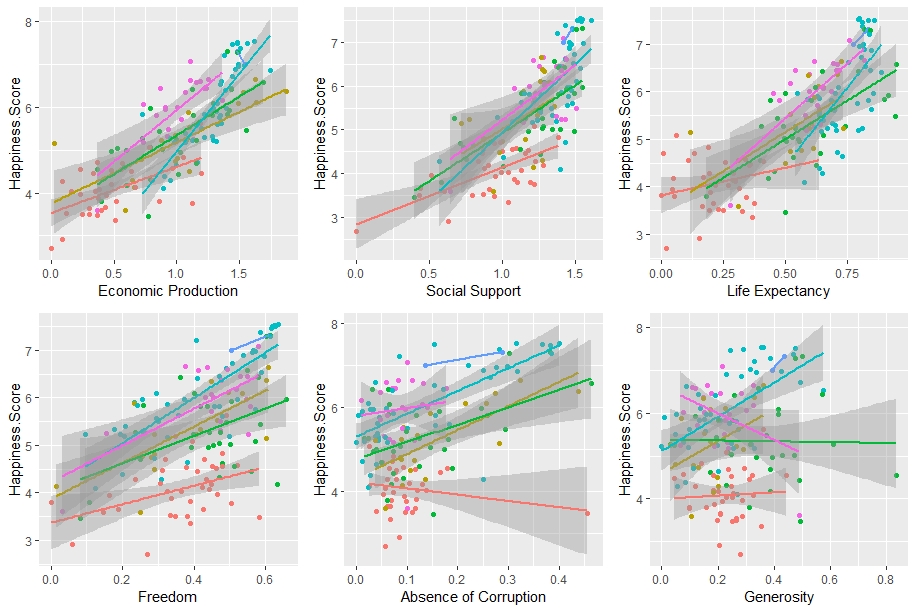
These graphs show each of the 6 major factors graphed against happiness scores for each country, colored based on the region in which they reside. The trend lines show a rough relationship between these variables, based on region. What trends and relationships do you begin to see?

While I am not diving into statistical significance on this post (please don’t email me…), some definite trends start to emerge. Regardless of region, greater economic production, social support, life expectancy, and freedom tend to give way to greater happiness, as defined as a sense of well-being. As you may notice, regions that, on average, ranked higher in overall happiness tend to have countries that score higher on these attributes.

While this is the case, relationships are a bit more muddied when looking at absence of corruption and sense of generosity. For Asia, Europe, and Arab States, absence of corruption tends to lead to a greater sense of happiness. Absence of corruption has less of a pull for countries in the Americas and Africa. Likewise, Africa and Asia do not have a tendency to let generosity affect their levels of happiness, compared to North America and Europe. Interestingly enough, happiness and generosity have a negative relationship for countries in South/Latin America.

Now, the key to all this data is that it is compared to a hypothetical Dystopia. We’ll now uncover which countries are most likely to be compared to this in the real world.

DYSTOPIA

A Dystopia, by definition, is an imaginary country in which everything is unpleasant (think George Orwell). In our playground, it is inhabited, theoretically, by the world’s least happy people. By comparing countries to this Dystopia as a benchmark, it allowed the report and its results to be positive in analysis. The Dystopia, in our case, is based on the lowest scores for each of the 6 major attributes. Let’s dig a little deeper and discover which countries would constitute our Dystopian society…

*This is simply meant for analysis. It is in no way condescending and should be used to guide action to lift up people who are affected by these conditions, not put them down*

6 Factors of our Dystopian Benchmark

  1. Economic production of Central African Republic
  2. Social support of Central African Republic
  3. Life expectancy of Lesotho
  4. Freedom of Angola
  5. Absence of corruption of Bosnia and Herzegovina
  6. Generosity of Greece

4 of our benchmarks are based on countries in Africa (2 are from the same country), while the remaining 2 are found in the southeastern part of Europe. Let this information serve as a catalyst to help those who have been marginalized against.

FINAL THOUGHTS

Happiness is not necessarily a choice. A country (and inherently, its region) is set up for well-being based on its geographic location, history, and access to resources. This manifests itself in economic production, life expectancy, and absence of corruption. In addition, cultural norms surrounding social support tend to play a role in a citizen’s overall well-being. Similarly, generosity plays different roles depending on regional differences. There is no perfect formula for creating well-being.

Lastly, it is in an undeniable right to be happy. No one deserves to live in a Dystopia.


Thanks for following my journey as I produced my first blog post using R Software. Share if you liked it and don’t hesitate to reach out. More is to come!