
It’s the holiday season and what better way to celebrate a time of cheer and reflection than by evaluating the human footprint on the world. Following this years assault on the environment, especially in the United States, I wanted to uncover the nature of our footprint – how wide and how deep is our mark. It is no coincidence that I stumbled upon a data-set curated by the Global Footprint Network, which is where our journey begins.
The Data
Per the network,
Biocapacity is measured by calculating the amount of biologically productive land and sea area available to provide the resources a population consumes and to absorb its wastes, given current technology and management practices. To make biocapacity comparable across space and time, areas are adjusted proportionally to their biological productivity. These adjusted areas are expressed in “global hectares”. Countries differ in the productivity of their ecosystems, and this is reflected in the accounts.
The Ecological Footprint of Consumption, in this case, indicates the “consumption of biocapacity by a country’s inhabitants” as a product of their Ecological Footprint of Production and their Net Ecological Footprint of Trade (imports – exports). This data set includes records from 1961 to 2014.
My entire analysis moving forward was conducted at a per capita level of a country’s inhabitants to mitigate population differences. Now that we’ve introduced a ton of confusing jargon, let me make things simple:
Ecological Creditors = Good
Ecological Debitors = Bad, probably
For you, just remember that a country contributes, as a creditor, if its footprint is smaller than its biocapicity; a country takes, as a debtor, if its footprint is larger than its biocapacity. Let’s dig in.
Global Overview
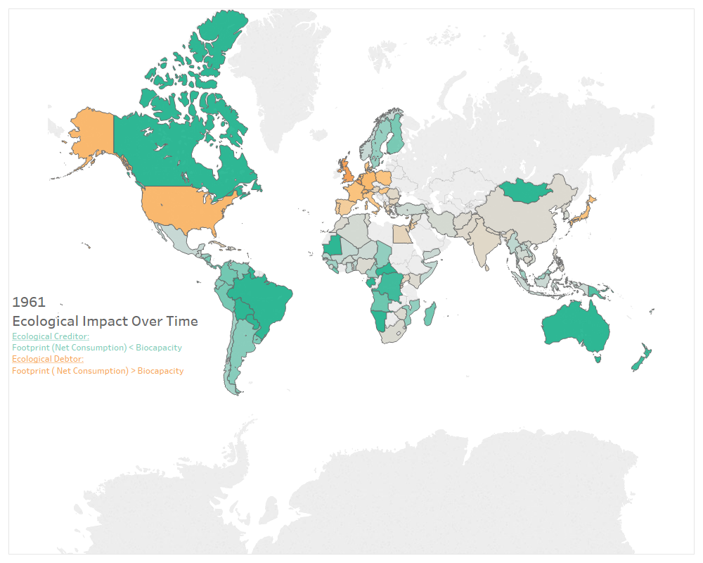
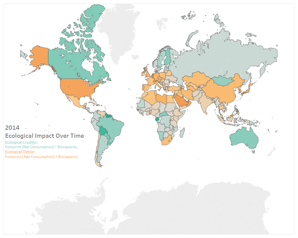
The maps above show a comparison in ecological impact from 1961 to 2014 (the range of the data set). A simple eye test leads you to learn that no country has gotten better over this time period – in fact, even the strongest creditors to the environment have started to consume more and more. As of 2014, here are the countries with the greatest biological productivity.
Top 5 Creditors to Society (2014):
- French Guina
- Suriname
- Guyana
- Gabon
- Bolivia
Here are the countries with the worst biological productivity.
Top 5 Debtors to Society (2014)
- Quatar
- Luxembourg
- United Arab Emirates
- Bahrain
- Kuwai
Countries in Africa, especially ones that are still agrarian in nature, tend to have the best equilibrium between production off of the land and their overall consumption – contributing more to society than they receive. Countries of the Middle East that rely heavily on imports, tend to be less productive. So, why is Luxembourg number two? I surmise this is due to their small population, which makes it difficult to reach economies of scale, and their geographical location, landlocked in the middle of Europe.
It can be seen globally, over time, what we take from the land is not being checked by what it contributes. To better understand this notion, I wanted to look at the key indicators that make up the Ecological Footprint.
Global Breakdown by Indicator
The Ecological Footprint is a combination of consumption, production, and trade based on the capabilities of four unique land types that contribute to our ability to live: forest land, crop land, fishing land, and grazing land. In addition, this formula accounts for pollution, we will see more on this later. A more comprehensive guide to these variables can be found at the link posted in the intro – but, these definitions are pretty self-explanatory.
To encapsulate most of the countries available, I analyzed these four land types by country at 1994 and at 2014. Again, these maps indicate the differences in the Ecological Footprint of Consumption over time. The brighter the hue of green or blue, the greater surplus of that land type. The browner, the greater the negative impact.
Similar to the global overview maps at the beginning of this post, we see a widening in the Ecological Footprint of Consumption across these four land types. To get a better understanding, I took the world average of the differences between consumption and production and plotted them over time by each land type. See below.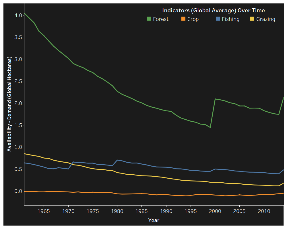
If the y-axis is difficult to understand, that is okay. Focus on the trajectory of the lines and the magnitude of their changes over time. The demand for crops routinely outweighs the supply of crop lands. Available forest land has dropped the most dramatically over the time span, but has made resurgences in 2000 and 2014. Land available for grazing has been slowly diminishing over time. If not counteracted, it will replicate crop land – there will be a global demand that outmatches supply. Fishing has been cyclical, but has been sloping down since the 1980’s.
None of these insights are especially positive. There are only two options for combating these trends: produce more land or monitor consumption in lieu of excess. Which seems feasible to you?
After uncovering these insights, I was interested in how the United States fairs…
The United State of Capitalism
While the United States was not a top 5 debtor of the earth’s resources, it isn’t far behind. The US had the 16th largest imbalance between consumption and biocapacity. This is striking, considering the productive output of the country and the vastness of its ecology and resources. Let’s take a look at its per capita use of resources across the different land types over time.
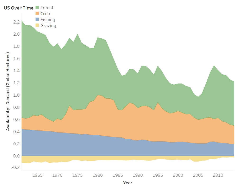
On pace with the rest of the world, the United States has continued to demand more and more forest land and materials over time. Fishing has also seen a negative trend. Contrary to the world’s average, the US sees a positive difference in consumption and available crop land. This would be a positive, if there wasn’t an evident downward trend. The only land type seeing a comeback is grazing land (from negative to almost zero).
Now you may be thinking, “Camden, what’s the big deal? The United States had a negative Ecological Footprint of Consumption before, but this graph looks positive! We are actually helping the world – we should be a creditor NOT a debtor…”
This graph doesn’t look too bad, huh? Well, as I mentioned before, the last part of the formula is pollution (i.e. carbon emissions). This is defined as the global hectares of world-average forest required to sequester carbon emissions from a particular region. I’ve introduced the same graph with this variable included below…
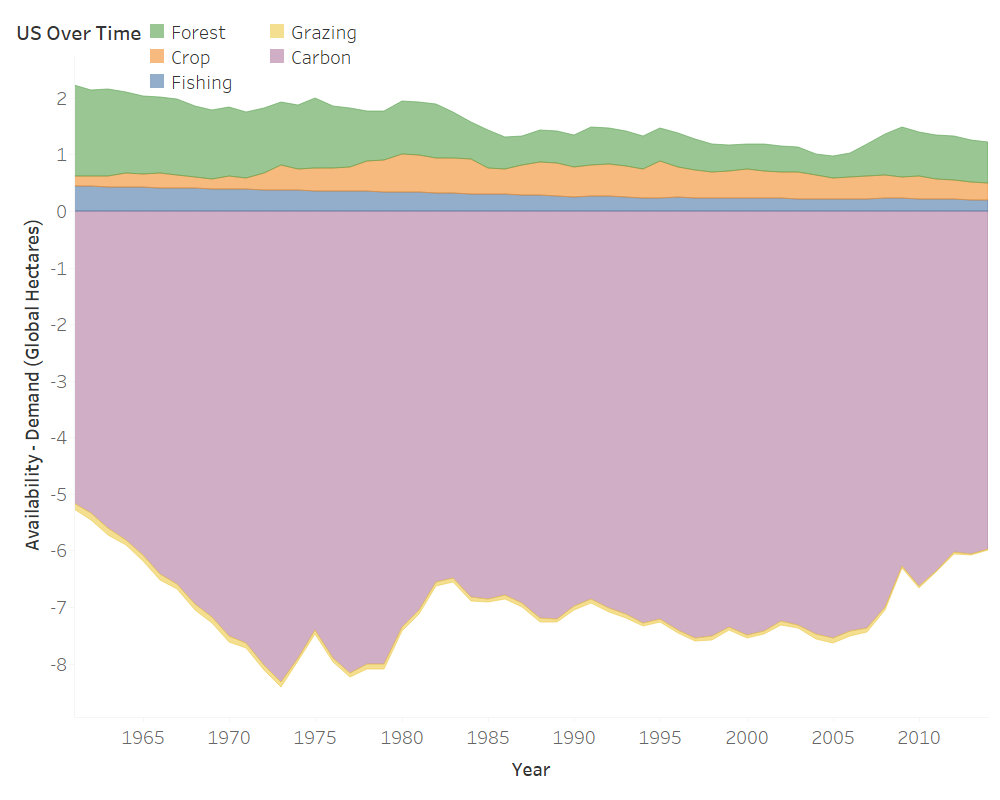
The surplus of the resources we create is greatly outweighed by the pollution we produce. As of 2014, we produced 4x more of a negative impact on the globe from pollution than the resources we “credited”. I’m no accountant, but that doesn’t look like a balanced sheet.
After unraveling this tale, I thought there may be more to the story. Perhaps what we see is on pace with population growth. Or, maybe, GDP could lend us some answers. The graphs that follow look at these variables in comparison to the changes in the total per capita differences in demand and availability in the United States.
Footprint of Population and GDP
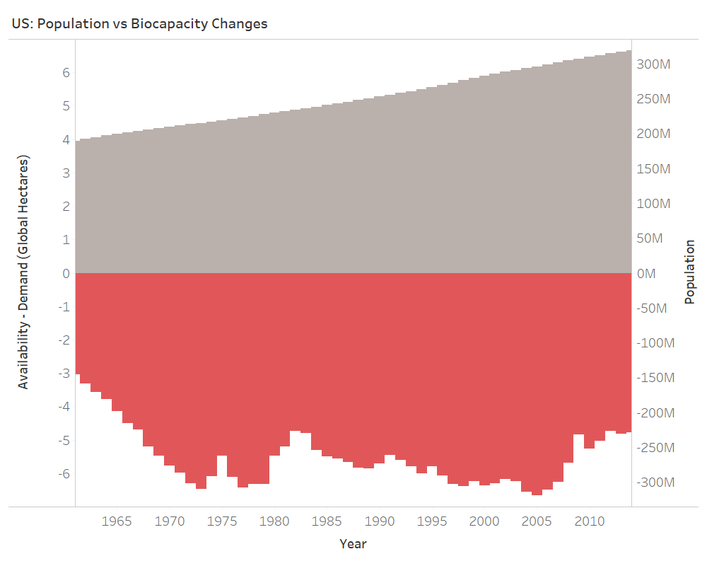 The US population has been growing at a linear pace since 1961. Changes in consumption have been more sporadic. Intuitively, population plays a role in in how much a country consumes. The variability in the plot of consumption, however, indicates more of an interaction between population and growth of consumption and any other number of variables not included in the data-set: policy, economic prosperity, war, etc. This being said, let’s take a look at GDP.

Like population, GDP has also been growing over time. More interesting, however, is that a dip in GDP coincides with, or is around, a dip in consumption. Gross Domestic Product is the summation of the total production that took place in the economy. A higher GDP indicates more production, higher salaries, and overall, theoretically, more consumption by consumers. I will go out on a limb and state that the upward trend in population and GDP does in-fact relate to the the downward trend in the availability of all four land types through the nature of income, demand, and consumption. These changes are hard to see, because of the overwhelming effect of pollution.
GDP Grows on Trees
This information is not new, but rather should serve as an extension of a discussion that needs to continually take place. You can’t recreate land that is lost, but we as a global community can reduce our footprint by:
- Changing consumption patterns, little by little, on an individual level.
- Looking for efficiencies that cut the demand for resources and mitigate pollution.
- Investing in human resources. Much of the earth is still rich with natural resources and the biggest dictator of their future is man.
Again, its the season of cheer. Create cheer for your family by working to shop smarter with your wallet this, and every, holiday season.
Cutting down a forest for timber adds to GDP, but what we don’t record is the loss to our wealth in terms of natural resources. Winnie Byanyima
Let’s work to correct the balance sheet.
Enjoy this post? Take a look at past posts:
Michael Jordan vs Lebron James
NYC: Where to go for a night out?
Risky Business and Rare Cooked Steaks
