
Two weeks ago I returned from the concrete jungle of San Francisco, lungs full of West Coast air and patience depleted from the West Coast traffic. Many of my peers asked how I did it? Who did I know? How did I draw up my resume to get through the process to an onsite interview? The answer was, “I don’t know.” It was mostly luck.
I had the opportunity to interview onsite at Google. I killed the interview. Not to brag, but I got my rejection email, and phone call – as if an email wasn’t enough, this past week. In any case, many told me that it was a success to even be considered by the internet giant. Even after I was denied, many asked me if there was a method to how I got in the door. I didn’t have an answer, but it did get me thinking… “What if I pulled Google job postings and ran some analysis to increase a person’s odds of getting an interview?”…
Methodology
Fortunately, thanks to the internet, I was able to find a data-set where someone had already done the scrappy work Google job postings have a standard layout, making it easy to scrape for the necessary information. Niyamat, who I found on Kaggle, used Selenium to scrape the Google Careers page for the job location, category, responsibilities, minimum qualifications, and preferred qualifications for every available job posting available a little under a year ago. I used his data set for the basis of my analysis.
Job Locations
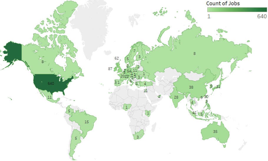
One clear way to increase your probability of reaching success is to consider regions that have a higher proportion of job opportunities. Not surprisingly, when this data was taken, there were 640 job postings for offices in the United States. But, what were the top countries outside of the United States?
Top 5 Countries (Omitting the United States):
- Ireland (87)
- United Kingdom (62)
- Germany (54)
- Singapore (41)
- China (38)
One technique could be to target regions that are less popular as technology hubs but make up a significant proportion (omitting the US) of Google job opportunities. When you think of Google, you think of Silicon Valley, and so does everyone else. You don’t necessarily think of the areas surrounding the United Kingdom or Singapore. These might be locations to target. Beyond job location, I wanted to look at the teams within Google and their relationships with job postings.
Job Categories
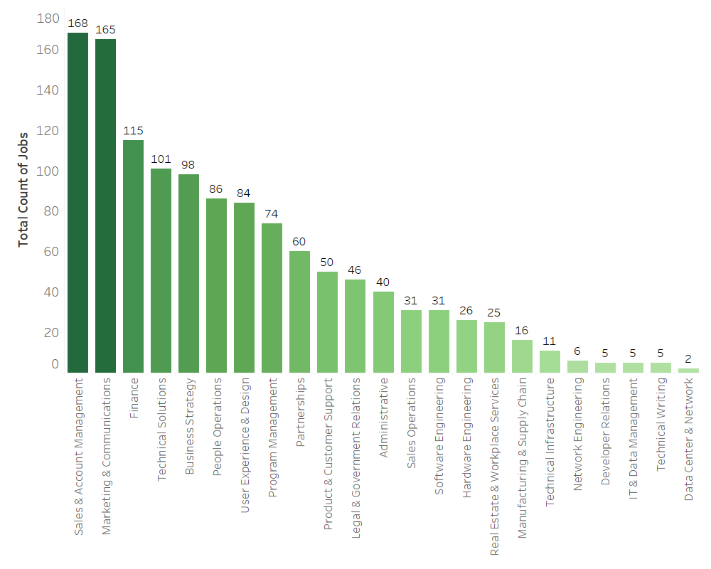
In addition to understanding where jobs are being posted, it is beneficial to know which teams garner the largest proportion of job postings. Sales and Account Management and Marketing and Communications are in a league of their own, making up ~27% of all job postings. But, what are the teams with the smallest number of job postings?
Toughest Teams to Get Into (based on count of job postings):
- Data Center & Network
- Technical Writing
- IT and Data Management
- Developer Relations
- Network Engineering
If you look at the midway point of the graph and move right, you’ll notice a larger proportion of the teams are more technical on the job spectrum. Though Google is a technology company, their focus in hiring is around client facing opportunities and business operations. In my own experience, myself and peers I have talked to, targeting jobs that are business facing increases your chance of getting an interview, and consequently a job, at Google, which will allow you to work up the ladder and earn a technical position later. This seems to be backed up by the data.
But, beyond targeting opportunities based on job location and team, how can you increase your chance of getting an interview? One common thing you’ll hear in any job search is to “match” your resume to the job posting. While this is true, text analysis may help us uncover what is more important to Google representatives as a whole (not just by position), allowing you to craft a resume to increase your odds of landing an interview across the organization.
Responsibilities
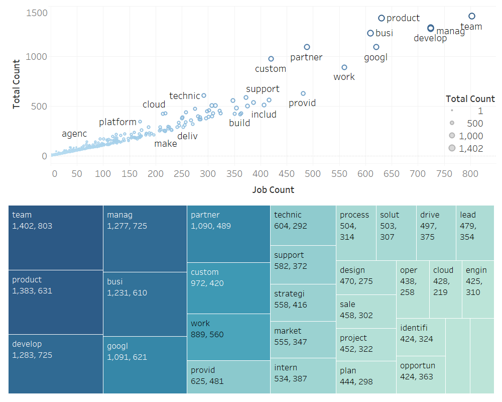
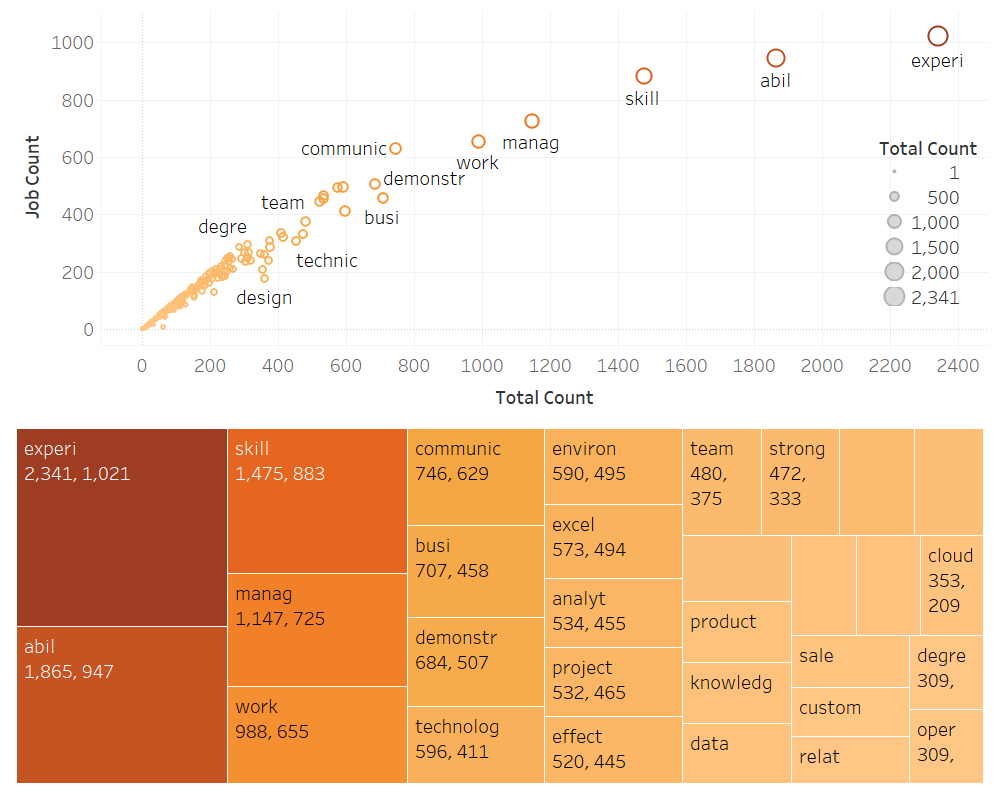
After running text analysis on the “Responsibilities” section of 1,250 job postings, here are the terms that came up the most. Two things to call out. First, these terms are the stems, used to group similar words (English is a complex language after all). Second, the first number in the tree map is the total number of times that the term was seen (total count). The following number is the number of jobs that this term was seen in (job count).
Collaboration, development, management, and dealing with product appeared in ~50% or more of the job postings. Other notable terms include: support, market, process, design, project, drive, solution, identify, etc. Having experience in these fields is very important. But, even more important for getting your resume seen, including these terms, no matter the job posting (within reason), will increase your odds of having your resume match a job posting and potentially lead to an interview.
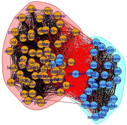
In addition to looking at the most frequent terms, I also wanted to see their relationships to each other. Below is a graphical representation of the hubs, authorities, and clustering of the terms and job responsibility descriptions.


This analysis reflects my previous point, that many of the important responsibility terms are shared across job descriptions and have links to many of the other terms – flowing to and from each other regardless of the type of job or description. The second graph is meant to show clusters of terms based on job descriptions. What is interesting is that it cannot be easily discerned that there are different clusters of jobs based on responsibilities to base our analysis. What does this mean? It means that these terms are influential across all types of jobs and their related job postings. This echoes my previous sentiment – include terms with high frequencies across job postings when casting a wider net to increase your odds, since job postings tend to be similar, at a high-level, across the stated responsibilities.
Minimum Qualifications
In addition to responsibilities, that you as an applicant want to match, it is also important to understand what minimum qualifications are required.
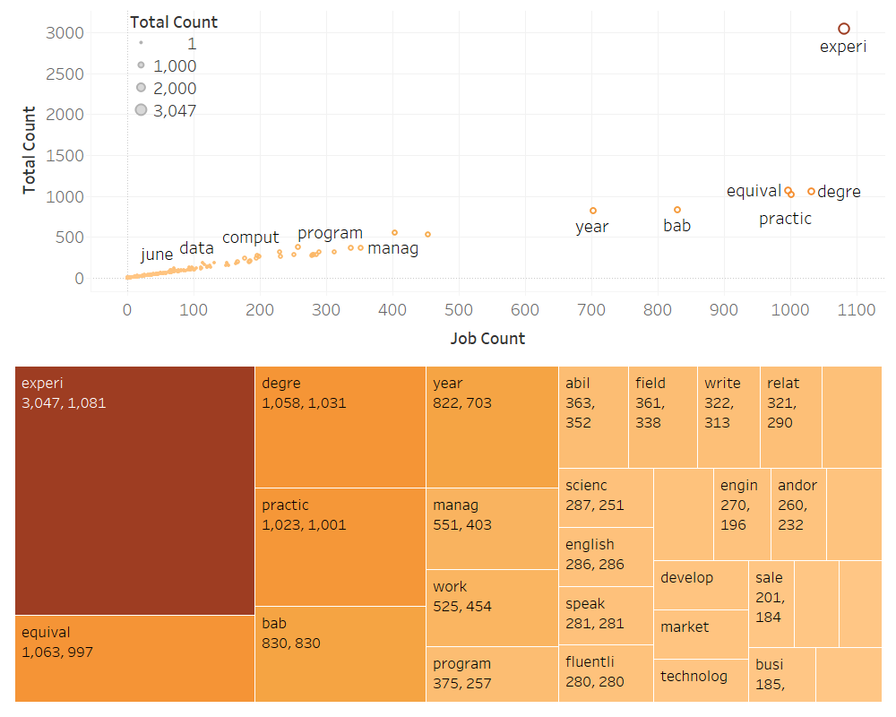
While minimum qualifications will differ depending on the team, location, and level of the job, there are important things to look for across most job descriptions. Across ~80% of job postings, having the appropriate practical experience and degree are a minimum requirement. This shouldn’t be news to anyone reading this post. What is novel are the other terms, which you could use to set yourself apart on your resume.
At a minimum, Google HR is looking for people who are efficient communicators, both in writing and in physical conversation. Fluency in a foreign language will also help to set you apart. Understanding in programming, marketing, engineering, and possessing general experience with technology, can help you leap this minimum qualification bar across a significant proportion of job descriptions.
Again, I wanted to look at the relationships of these terms and their associated job descriptions. The first graph shows terms that appear in 5% or more of job postings.
Unlike responsibilities, we see two clear clusters emerge: jobs for interns, MBAs, and new graduates, and jobs for more experienced employees. For experienced employees, they are looking for specific skills and experiences: SQL, Java, foreign languages, development, media, strategy, etc. For new graduates, they are looking for basic requirements – are you a student? And, they are looking at your availability – can you start in May or June? While they want experience and skills coupled with these minimum requirements, education and start date are uniquely important to this cohort.
While this is interesting, I wanted to cut down on the number of important terms. Below is a network analysis of terms that appear in 10% of job postings.


Similar to responsibilities, there is only one cluster for minimum qualifications. Understanding these minimum qualifications and understanding how to craft them into your resume will help you to get past the proverbial resume bot.
Preferred Qualifications
The last section I analyzed was “Preferred Qualifications”. Below are the most frequent terms.
You’ll notice that many of these terms are similar to the minimum qualifications. So, why have two different sections? Well, here they are looking for you to demonstrate your unique abilities and skills. They want you to have project experience. But, interestingly enough, across many of the positions, they want to see that you are knowledgeable, that you know how to handle relationships, that you work well in diverse teams and environments, that you are effective in the work that you do, that you know how to work with data, and, finally, that you know how to use Microsoft Excel. A lot of these are gimmes, but don’t miss out on getting an interview because you didn’t include them in your resume – they are in the “Preferred Qualification” section for a reason.
After analyzing these frequencies, I ran a network analysis. Originally I ran it at the same 5% level as I did for the minimum qualification analysis, but the result was too crowded and not useful for interpretation. So, I ran the analysis on terms that appeared in 10% or more of job postings and some groups actually started to emerge.


Preferred qualifications is where job descriptions start to take on their own character – this is the only place we see numerous clusters. These clusters seem team oriented: solutions, science (presumably data), and design. There also appears to be a preference for master’s students, judging by the green cluster. Even so, many of the terms are shared between clusters and make up a giant cluster of their own indicating what we’ve already uncovered. That is, that many of the job descriptions share similar components in the way they describe their preferred qualifications.
Final Thoughts
So what? Well, first off, your guidance counselor apparently knows what they are talking about. Google does care if you have a degree (they might even prefer a master’s degree). Google does care if you have their minimum qualifications and skills. But, even so, job postings may not be as different as you or I previously believed.
There might be ways to increase your odds of getting your resume through the job submission black hole and into the right hands, across job postings, which may lead to an interview. Here are some final thoughts from this analysis:
- Target the United States. In addition, look for Google locations that have a high number of offerings but may not be seen as a technology hub.
- Target business and operation facing teams. They have the lion-share of the job postings and may allow you cast a wider net for opportunities. Avoid technical leaning positions, especially if you are earlier in your job journey.
- Look for ways to streamline your resume for Google’s needs. They clearly have items they look for, no matter the position or team. Here are some examples of what to include:
- Responsibilities: Experience with collaboration, development, management, product, support, marketing, processes, design, projects, driving solutions, identifying challenges and solutions, etc.
- Minimum Qualifications: Efficient communication (written and spoken), fluency in foreign languages, experience with programming, marketing, engineering, technology, etc.
- Preferred Qualifications: At a high level, should definitely include – knowledge, relationship management, experience in teams and environments, effectiveness, experience with data, and excel expertise. Need to customize to better fit job description, depending on the team.
- Know Excel: Apparently data-driven tech companies still feel that this needs to be stated…
Last Note: Google revolutionized how we engage with information. Though it is an amazing company to work for, there are many other companies paving the way in Big Data, martech, and digital solutions. I hope you find this analysis helpful and guiding, but it doesn’t replace hard-work, dedication, and passion. If you are on the job-hunt, enjoy the journey! You will be rejected. It happens. But as they say, when one door closes another one opens.
I don’t want to live in a world where someone else is making the world a better place better than we are. Gavin Belson
If you have any questions (about this blog post, the job search, or anything else), feel free to reach out! For those on the job hunt, I highly suggest this book for alleviating unnecessary anxiety and work:
Enjoy this post? Take a look at past posts:
Michael Jordan vs Lebron James
NYC: Where to go for a night out?

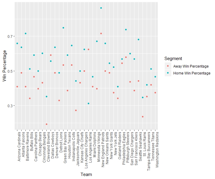 As it can be seen, the win percentage of games played at home tends to be higher than the win percentage of games played as a visiting team. Out of all of the teams over this 11 year period, there are only two teams where this does not hold: the Dallas Cowboys and Los Angeles Rams. The LA Rams have a much smaller sample size, due to their move in 2016, causing unsurprising variability from the norm. But, for Dallas, how can you claim to be America’s team when you aren’t even Texas’ team?…


